Flutterは、Googleが開発したオープンソースのモバイルアプリケーションフレームワークです。Flutterは、高速なアプリケーション開発を支援し、多くの機能やウィジェットを提供します。Flutterのウィジェットは、アプリケーションの様々な要素を構成することができ、その中でもボタンを作成するためのウィジェットの一つに、OutlinedButtonがあります。
OutlinedButtonは、ボタンの周囲に枠線が表示されます。また、テキストやアイコンを含めることができます。この記事では、FlutterのOutlinedButtonの使い方について説明します。
OutlinedButtonの基本的な使い方
OutlinedButtonの基本的な使い方は以下の通りです。
OutlinedButtonを作成
OutlinedButton(
  onPressed: () {
    // ボタンがタップされたときの処理をここに書く
  },
  child: Text('ボタンのテキスト'),
),
このコードでは、OutlinedButtonを作成し、テキストを設定しています。onPressedプロパティには、ボタンがタップされたときに実行される関数を指定します。
基本的な使い方のサンプルコード
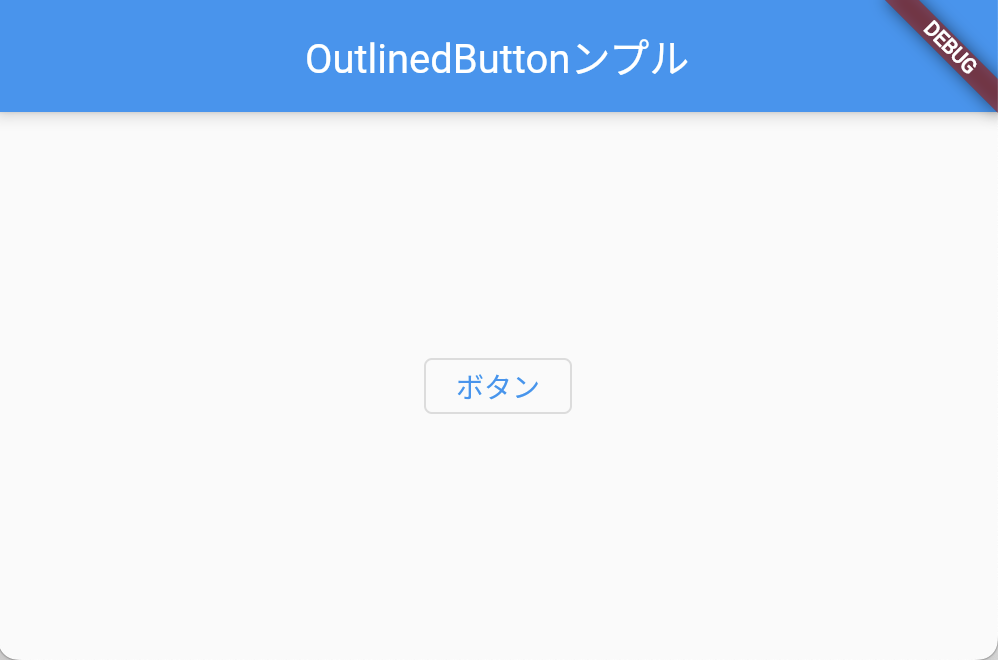
styleを適用しない、シンプルなOutlinedButtonのサンプルコード・実行結果は以下の通り。
import 'package:flutter/material.dart';

void main() => runApp(MyApp());

class MyApp extends StatelessWidget {
  @override
  Widget build(BuildContext context) {
    return MaterialApp(
      title: 'OutlinedButtonサンプル',
      home: Scaffold(
        appBar: AppBar(
          title: Text('OutlinedButtonンプル'),
        ),
        body: Center(
          child: OutlinedButton(
            onPressed: () {
              // ボタンがタップされたときの処理
              print('ボタンがタップされました');
            },
            child: Text('ボタン'),
          ),
        ),
      ),
    );
  }
}
スタイルを適用する
使い方
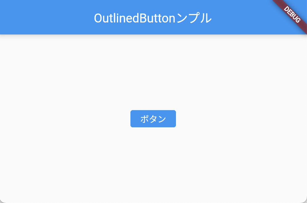
OutlinedButtonは、デフォルトでシステムテーマに合わせたスタイルが適用されます。しかし、スタイルをカスタマイズすることもできます。例えば、枠線の色や太さ、テキストのスタイルを変更することができます。
OutlinedButton(
  onPressed: () {
    // ボタンがタップされたときの処理をここに書く
  },
  style: OutlinedButton.styleFrom(
    foregroundColor: Colors.white, // テキストの色
    backgroundColor: Colors.blue, // 背景色
    side: BorderSide(color: Colors.blue, width: 2), // 枠線の設定
  ),
  child: Text('カスタマイズしたボタン'),
),styleプロパティに、スタイルを設定するためのメソッド、OutlinedButton.styleFrom()を指定します。このメソッドには、以下のようなパラメータを指定することができます。
- foregroundColor: テキストの色
- backgroundColor: 背景色
- side: 枠線の設定
上記の例では、ボタンのテキストの色を白に、背景色を青に、枠線の色を青、幅を2に設定しています。
スタイルを適用するサンプルコード
上記、styleを適用した場合ソースコード・実行結果は以下の通りです。
import 'package:flutter/material.dart';

void main() => runApp(MyApp());

class MyApp extends StatelessWidget {
  @override
  Widget build(BuildContext context) {
    return MaterialApp(
      title: 'OutlinedButtonサンプル',
      home: Scaffold(
        appBar: AppBar(
          title: Text('OutlinedButtonサンプル'),
        ),
        body: Center(
          child: OutlinedButton(
            onPressed: () {
              // ボタンがタップされたときの処理
              print('ボタンがタップされました');
            },
            child: Text('ボタン'),
            style: OutlinedButton.styleFrom(
              foregroundColor: Colors.white, // テキストの色
              backgroundColor: Colors.blue, // 背景色
              side: BorderSide(color: Colors.blue, width: 2), // 枠線の設定
            ),
          ),
        ),
      ),
    );
  }
}
アイコンを含めたOutlinedButton
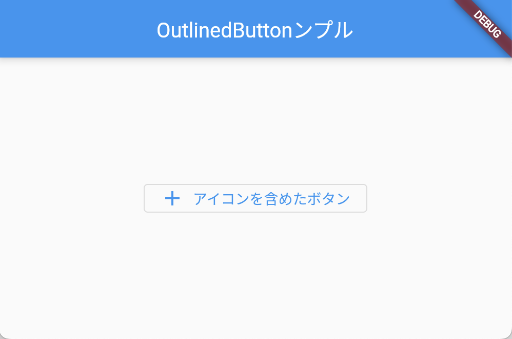
OutlinedButtonは、テキストだけでなく、アイコンを含めることもできます。以下のように、Iconウィジェットをchildプロパティに指定します。
使い方
OutlinedButton.icon(
  onPressed: () {
    // ボタンがタップされたときの処理をここに書く
  },
  icon: Icon(Icons.add), // アイコンの設定
  label: Text('アイコンを含めたボタン'), // テキストの設定
),
アイコン含めたボタンのサンプルコード
import 'package:flutter/material.dart';

void main() => runApp(MyApp());

class MyApp extends StatelessWidget {
  @override
  Widget build(BuildContext context) {
    return MaterialApp(
      title: 'OutlinedButtonサンプル',
      home: Scaffold(
        appBar: AppBar(
          title: Text('OutlinedButtonンプル'),
        ),
        body: Center(
          child: OutlinedButton.icon(
            onPressed: () {
              // ボタンがタップされたときの処理をここに書く
            },
            icon: Icon(Icons.add), // アイコンの設定
            label: Text('アイコンを含めたボタン'), // テキストの設定
          ),
        ),
      ),
    );
  }
}
ボタンの無効化
ボタンを無効化することもできます。これは、ボタンが現在の状態で押せないときに使用します。例えば、フォームが正しく入力されていない場合に、送信ボタンを無効にすることができます。
OutlinedButton(
  onPressed: null, // nullにすると、ボタンが無効化されます
  child: Text('無効化したボタン'),
),
まとめ
OutlinedButtonは、TextButtonとElevatedButtonの中間に位置するボタンで、ボタンの周囲に枠線が表示されます。また、テキストやアイコンを含めることができます。OutlinedButtonを作成するには、flutterのマテリアルパッケージをインポートして、OutlinedButtonウィジェットを作成します。ボタンのスタイルをカスタマイズしたり、アイコンを含めたり、ボタンを無効化することもできます。